The lit geek in me is also pleased by the accidental resemblance to the color scheme Joyce demanded for the cover of Ulysses (the blue was to represent the Mediterranean, the white islands, if I'm recalling correctly). Beyond the idea of wandering, there's no connection between the album and the book—certainly nothing deliberate—but I like the coincidence.
|
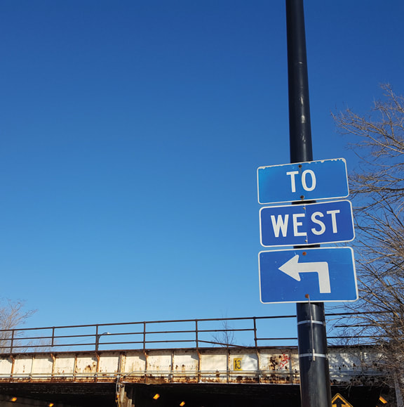
First look: here's the cover photo for Highway Gothic. It's from the onramp to I-94 at Lawrence and Cicero; the lozenge for "94" is mysteriously missing, leaving this odd direction to...the frontier? Manifest Destiny? Some other promise betrayed? (If you've been there, you know the arrow is actually pointing north: one must put a lot of trust in this sign.) This feels about right, for a road album, and specifically an album that begins in the suburbs and ends in the Badlands. I love the color of the sky—a massive lucky break, as I knew I wanted blue, but had no guarantee of getting it until...well, April, probably, the way this winter has been going. The big open negative space is as close as we'll come to duplicating a genuine Western sky in Chicago. I think it asks a question.
The lit geek in me is also pleased by the accidental resemblance to the color scheme Joyce demanded for the cover of Ulysses (the blue was to represent the Mediterranean, the white islands, if I'm recalling correctly). Beyond the idea of wandering, there's no connection between the album and the book—certainly nothing deliberate—but I like the coincidence.
0 Comments
Leave a Reply. |
Liz BagbySongwriter & multidisciplinary artist Archives
July 2024
Categories |

 RSS Feed